New appearance, same standards: What lies behind our new look
2 minutes
Jul 2, 2026
We have rethought our brand – and our website as well. Our rebranding is the result of a fundamental question: What must a financial communications agency stand for in the year 2026?
Since 1996, we have been accompanying companies from asset management, banking, the real estate and insurance industries, as well as fintechs. At our two locations, we combine the editorial and creative strength of our Hamburg origins with the close proximity to Frankfurt, Germany's most important financial hub.
In the last three decades, the communications industry has fundamentally changed. Media operates faster, target groups inform themselves more directly, and topics emerge on more channels simultaneously. What used to be primarily public relations today combines strategy, data, editorial work, social media, artificial intelligence, and community building.

What financial communication means today
Good financial communication begins with understanding. Anyone communicating about markets, products, regulation, or transformation must be able to put the topics into context: professionally, strategically, and tailored to the target audience. Only then is content created that is truly relevant.
Our new claim sums up our work perfectly:
From content to community.
From strategy to story.
From 1996 to today.
We build a community around the brand.

Two fonts, one statement
Our new logo combines two fonts that rarely appear together: Times New Roman and Urbanist. First, a serif font with centuries of tradition, then a narrow typeface built for modern screens and speed.
Times New Roman stands for experience, diligence, and thirty years in an industry that does not give trust away. Urbanist stands for craftsmanship that works today: data, channels, and new formats. Our new logo is the best of both worlds.

Substance meets precision
The revised corporate design translates this aspiration into a clear visual language. The color palette is reduced and decisive:
Elbe Green stands for calmness and substance.
Honey Gold sets targeted accents.
Office Linen gives room for texts, images, and thoughts.
Every color has a function. They are places, moods, a piece of Hamburg.
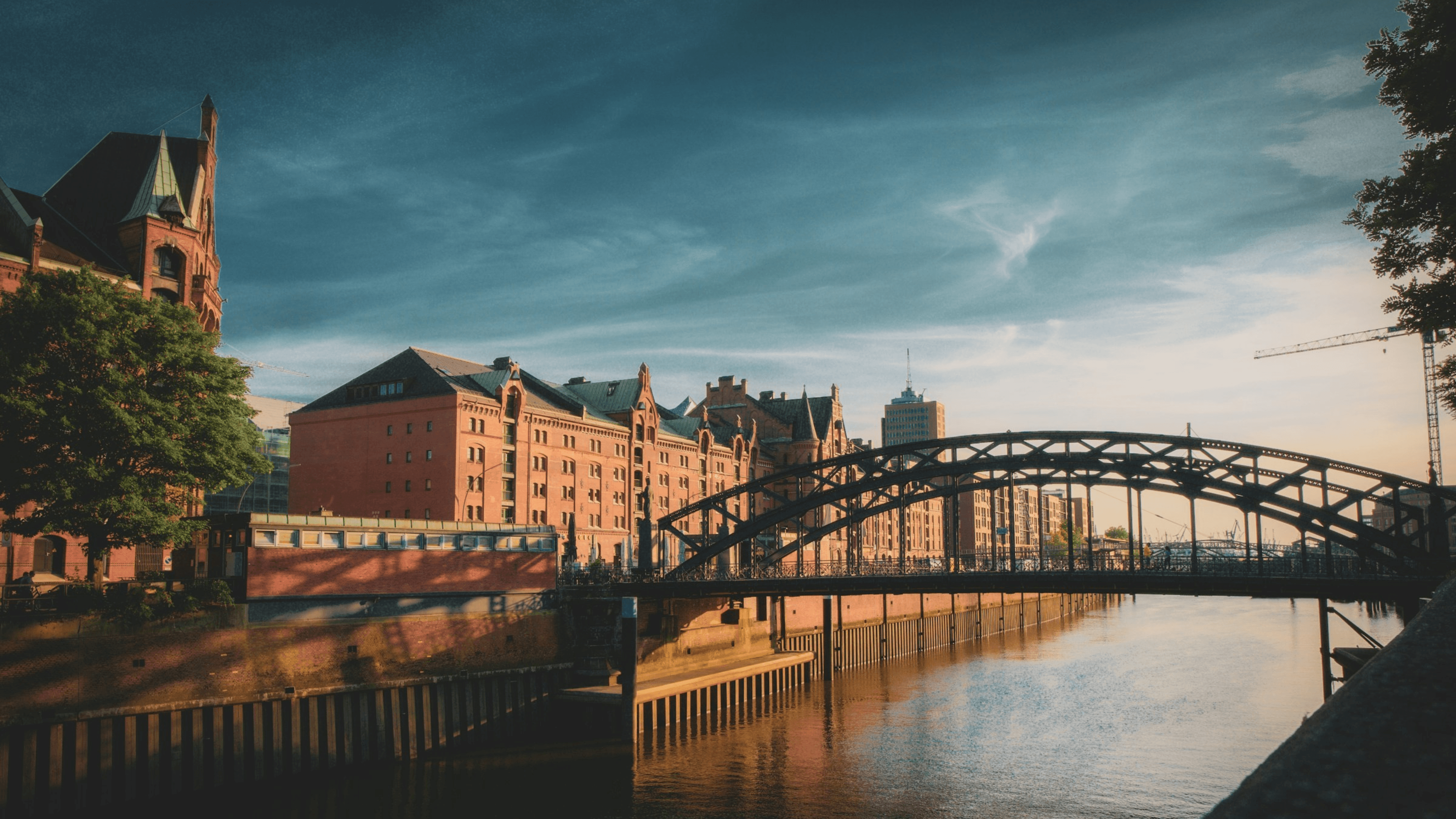
The green has been there from the start, since the founding of public imaging. It remains. But it has changed: deeper, calmer, more decisive. The flashy green has become a primary color that supports our entire brand. Hamburg is the home of our agency. This is now also anchored in our color world.
Not a break, but clarity
Our rebranding is a consolidation of our service portfolio and our approach: classic public relations, content, multimedia, social media, events, and artificial intelligence. Always with the goal of connecting relevance and reach. What is new is the clarity with which this aspiration is visible today.
More News


Do you have something to say?
We know where it will be heard.